Measurement / Field brief
Measure Waiting Time Before You Measure Productivity
Most workflow delay occurs between activities, so elapsed time and queue age reveal more than counts of completed tasks.
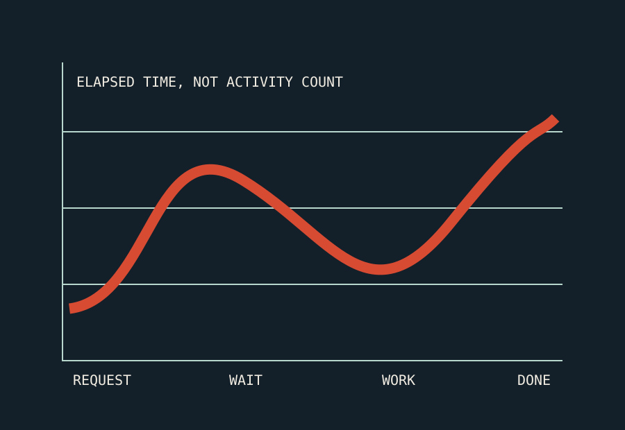
Workflow dashboards often start with activity counts: cases completed, messages sent, reviews performed, and tasks closed. These numbers can describe effort, but they do not always describe service. A team can complete more tasks while cases spend longer waiting between them.
Elapsed time follows the case from a defined start to a defined end. It includes both active work and waiting. This makes it a useful first measure when the goal is to improve how quickly a reader, customer, employee, or partner receives an outcome.
Define the clock from the recipient’s view
Choose the event that the recipient reasonably understands as the start. It may be the time a complete request is received, not the time an employee opens it. Define completion as the delivery of a usable result, not an internal status change that leaves more work for the recipient.
Record exclusions clearly. If the clock pauses while required information is missing, show both gross elapsed time and adjusted time. Hiding the pause can make the service appear faster than the lived experience. Keeping both values shows where delay originates.
Split work time from wait time
For each transition, record when a case became ready and when the next action began. The difference is queue time. Also record how long the action itself took. A five-minute check can create a three-day delay if it waits in the wrong queue.
This distinction changes the improvement method. Long work time can call for training, clearer tools, or a simpler task. Long wait time can call for better routing, capacity, priority rules, or smaller batches. Treating both as “processing time” hides the choice.
Use distributions, not only averages
An average can hide a small group of very old cases. Report the median and useful percentiles, such as the time within which 80 or 90 percent of cases finish. Also show the oldest open cases. The exact set of measures should match the consequence of delay.
Segment results by case type, risk class, channel, and exception reason. Do not compare unlike work as if it were one queue. A complex investigation and a routine address correction need different expectations.
Watch arrivals and departures
A queue grows when arrivals exceed departures over a meaningful period. A temporary increase can be normal. Persistent growth means the service level is not sustainable at the current demand and capacity.
Track the number of new cases, resolved cases, open cases, and age of open work. A team can reduce the queue by closing easy new work while difficult old work remains. Age bands make that pattern visible.
Pair speed with quality
Faster is not better if cases return, decisions are reversed, or required controls are skipped. Add measures for rework, reopening, correction, complaint, and audit failure. Use these as guardrails rather than one blended score that no one can interpret.
Avoid individual productivity rankings based on raw counts. People handling complex exceptions will appear slower than people handling routine cases. That pressure encourages easy-case selection and premature closure. Measure the performance of the workflow and investigate variation with context.
Turn the measure into a decision
A dashboard is useful when it leads to an operating choice. Decide in advance what happens when queue age, exception volume, or rework crosses a threshold. The response can include temporary capacity, a routing change, or a root-cause review.
Start with one service, one clear clock, and a small set of measures. Follow real cases through the data and compare the record with what people experienced. When the measures agree with the work, they can guide improvement. When they do not, fix the measurement before using it to judge the team.